Read Time: 1 min
Spring 2024
B2C
Building the 0-1 design system for EmpowerMe reducing sprints by 40%

Context
EmpowerMe started as a small volunteer project with a big ambition; to help early-career developers move past self-doubt and actually feel ready to apply for jobs. Most tools focus on hard skills; we wanted to focus on belief.
I led the product design from the ground up and connected cross functional teams, shaping a simple flow that helped users surface their transferable skills. We built fast, tested with real users, and the results were encouraging; not just in metrics, but in the way people responded.
It was scrappy, messy, and deeply meaningful. And it reminded me just how powerful design can be when it meets people where they are.
TOOLS
Figma
TAGS
Design System • B2C
DURATION
1 week(Phase 1)
COLLABORATORS


→ TL;DR
EmpowerMe needed a cohesive visual system to ensure design consistency and dev handoff due to time constraint
Built 0-1 design system, defining foundations, core components, and patterns. Created structured handoff files
Reduced design-developer clarification cycles by 40%
Cut UI-related QA bugs by half during final sprint
Improved cross-team velocity with reusable components
Adopted by 100% of new EmpowerMe features
MY CONTRIBUTION
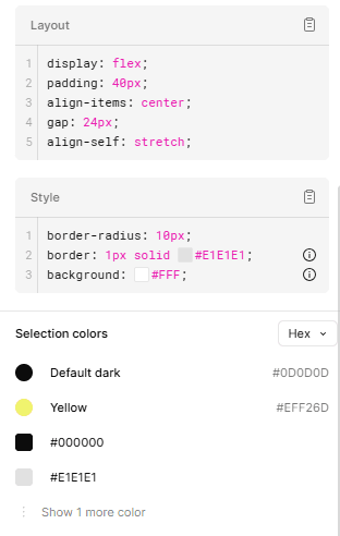
Defined color tokens, type scale, spacing system
Built reusable components in Figma with clear naming and variants
Created dev-ready CSS3 specs and component documentation
→ Bridging the solution to problem
Design system helped us speed up the sprint cycle by 40%

→ The design process
WHY
Why a design system?
Due to the developer mishap we were pushed back by 2 weeks in our sprint - we needed faster design process
New product → high risk of inconsistency
Iterations were frequent → needed speed and alignment
Needed to ensure accessibility, dev clarity, and future scalability
RESEARCH
Laying down the foundation
I was new to design system. I had worked on small scale systems for my project but it was my first time building it for consistency and easy dev handoff. I had to relearn a lot of stuff. What helped me was the Atomic Design principles.

I followed Atomic Design principles for this project
RESEARCH
Why It All Matters
EmpowerMe's Vision
To reduce application anxiety and help users showcase their full potential
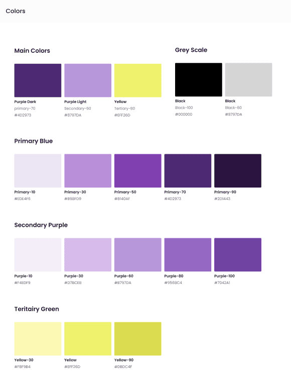
Colors
We chose purple as our primary to reflect confidence and transformation, aligning with EmpowerMe’s mission to help users overcome self-doubt.
Yellow acts as an accent to guide action and bring energy to key moments, like CTAs.
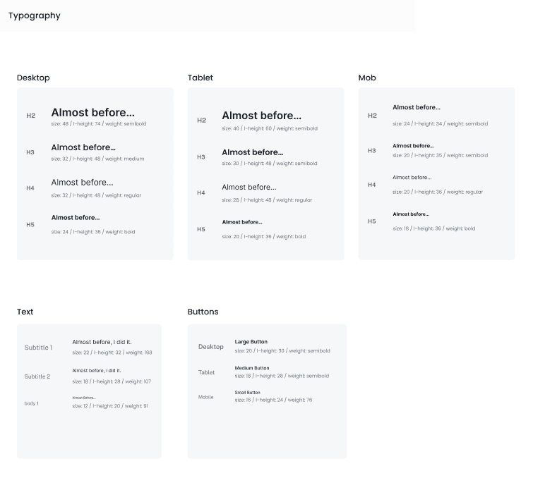
Typography
We used Inter for its clean, approachable feel and strong readability across devices.
The responsive type scale helped maintain clarity, especially in form-heavy screens and mobile views.
COMPONENTS
Building the system, following components and patterns
What I focused on
Colors and typography
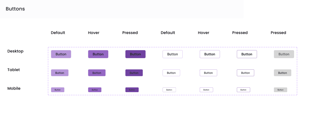
Buttons
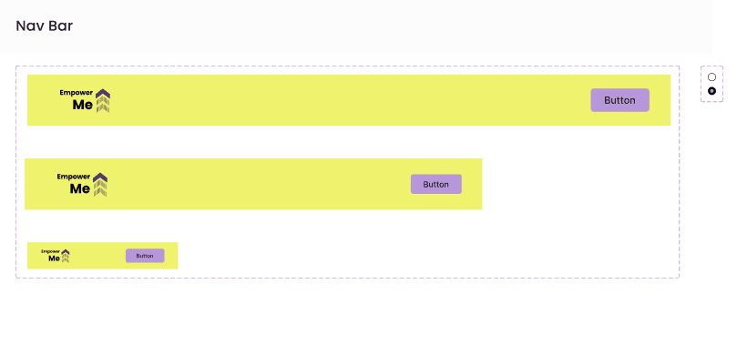
Navigation Bar
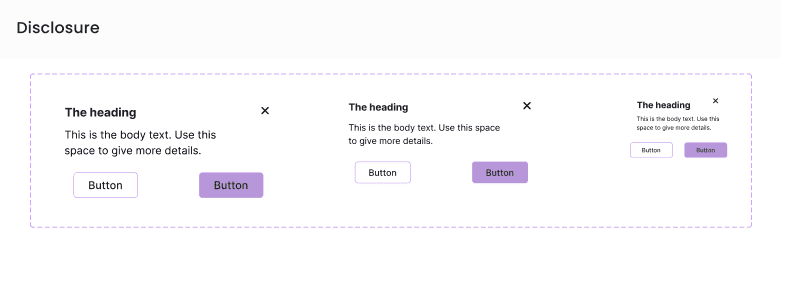
Disclosure Card
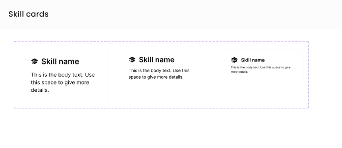
Skills Card
Skills List
Quote
Landing Page Steps
Landing Page Info Cards
Buttons
Navigation bar
Disclosure card
Skills Card
HANDOFF
The handoff - Figma to Dev
To streamline dev handoff, I used Figma Inspect so developers could directly view specs, spacing, and styles from the source of truth — the design file itself. This reduced back-and-forth and made it easier for devs to pick up components with minimal ambiguity


ACCESSIBILITY
Keeping everything under check with accessibility
I ensured the design system met WCAG AA standards for contrast, including primary and accent colors. All components followed best practices for readable typography, tap targets, and form clarity. This helped create a product that was usable and inclusive from day one.
→ Conclusion
Impact on the users and product
Reduced design-developer clarification cycles by 40%
Cut UI-related QA bugs by half during final sprint
Improved cross-team velocity with reusable components
Adopted by 100% of new EmpowerMe features
Reflecting my journey
If I were to scale the system further, I’d add more component documentation earlier — especially usage do’s/don’ts. I learned how valuable naming consistency and token structure is for speed and team alignment. Next time, I’d explore automating tokens for dev teams using tools like Style Dictionary or Figma-to-Code plugins. The biggest win was seeing how a lightweight but intentional system can remove friction — and let teams focus on building impact.